
Introduction
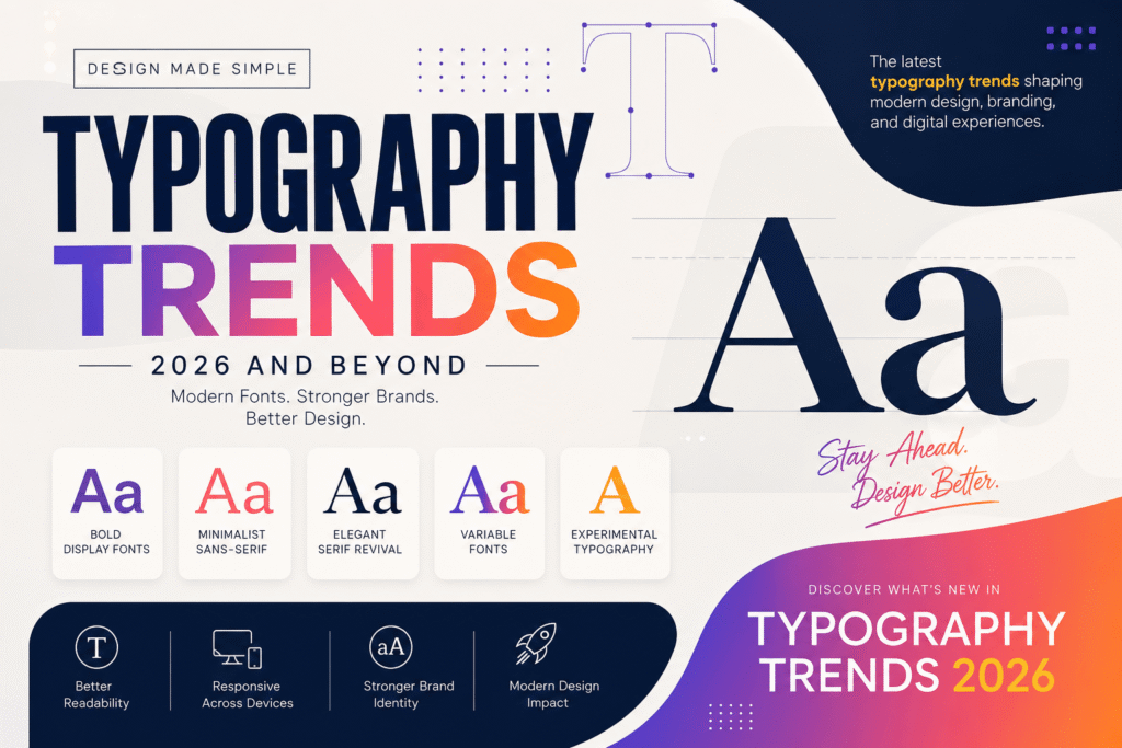
Typography trends continue to shape the way brands communicate, websites engage users, and designers create memorable experiences. While colors and imagery often capture attention first, typography is what guides readers through content, builds trust, and strengthens visual identity.
As we move through 2026, typography has become more than selecting an attractive font. Designers now focus on accessibility, responsiveness, brand personality, and user experience across desktops, tablets, and mobile devices. Whether you’re creating a business website, developing a brand identity, designing social media graphics, or building marketing materials, understanding modern typography trends helps your work stand out in an increasingly competitive digital landscape.
This guide explores the biggest typography trends of 2026, practical applications, and actionable tips that designers, marketers, business owners, and beginners can use to create professional, engaging designs.
Table of Contents
- Why Typography Trends Matter
- What Is Modern Typography?
- Top Typography Trends in 2026
- How Typography Impacts Branding
- Benefits of Following Typography Trends
- Typography Best Practices
- Common Typography Mistakes
- Practical Typography Checklist
- Internal & External Resources
- Frequently Asked Questions
- Conclusion
Why Typography Trends Matter
Typography is often called the “voice” of a design. Before users read a single sentence, they subconsciously judge a brand based on its typography choices.
Good typography helps users:
- Read content effortlessly
- Navigate websites more easily
- Recognize brands instantly
- Build trust and professionalism
- Improve accessibility
- Increase engagement and conversions
Businesses across the USA, Canada, Europe, and the UK are investing more in thoughtful typography because customers expect clean, user-friendly digital experiences. A well-designed type system not only enhances aesthetics but also supports usability and reinforces a consistent brand identity.
Example:
A modern SaaS company may use a clean sans-serif font with generous spacing to communicate innovation and simplicity, while a luxury fashion brand may choose elegant serif typography to convey sophistication and heritage.
Typography is no longer just a design choice—it is a strategic business asset.
Modern Typography Trends Explained
Modern typography is the thoughtful arrangement of text to improve readability, accessibility, and visual communication across both print and digital platforms.
It involves much more than selecting a font. Designers carefully consider:
Font Selection
Choosing fonts that reflect the brand’s personality while remaining easy to read.
Hierarchy
Using different font sizes, weights, and spacing to guide readers through content naturally.
Spacing
Managing line height, letter spacing, margins, and white space to create comfortable reading experiences.
Responsiveness
Ensuring typography scales seamlessly across desktops, tablets, and smartphones.
Accessibility
Designing text that is readable for all users, including those with visual impairments, by maintaining sufficient contrast and appropriate font sizes.
Top Typography Trends in 2026
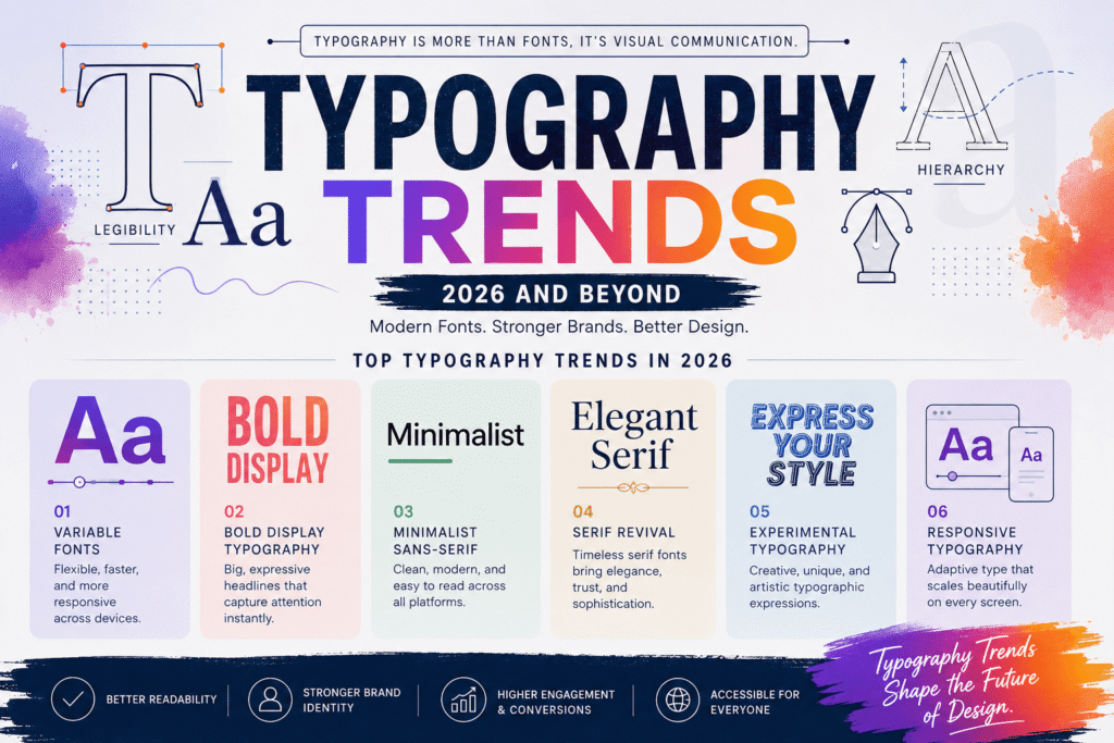
Typography continues to evolve alongside technology, branding, and user expectations. The following trends are influencing websites, digital products, and marketing campaigns worldwide.
1. Variable Fonts Continue to Dominate
Variable fonts remain one of the most significant typography innovations. Instead of loading multiple font files for different weights and styles, a single variable font file can provide a wide range of options.
Benefits include:
- Faster website performance
- Reduced loading times
- Greater design flexibility
- Improved responsive design
- Better user experience
For WordPress websites built with Elementor, variable fonts help improve page speed while offering more creative control over typography.
2. Bold Display Typography
Large, confident headlines continue to dominate modern web design.
Designers are using oversized typography to:
- Capture attention immediately
- Highlight key messages
- Improve content hierarchy
- Strengthen brand personality
Bold typography works particularly well on:
- Landing pages
- Portfolio websites
- Agency homepages
- Product launches
- Hero sections
However, balance is essential. Pair bold headings with clean body text to maintain readability.
3. Minimalist Sans-Serif Fonts
Minimalism remains a defining trend in digital design. Clean sans-serif typefaces continue to be popular because they are easy to read across devices and align well with modern aesthetics.
Popular characteristics include:
- Simple letterforms
- High readability
- Excellent mobile performance
- Contemporary appearance
- Versatility across industries
Technology companies, startups, and eCommerce brands frequently adopt minimalist typography to communicate clarity, efficiency, and innovation.
4. Elegant Serif Revival
While sans-serif fonts dominate digital interfaces, serif typography has made a strong comeback in branding and editorial design.
Modern serif fonts now blend traditional elegance with contemporary styling, making them ideal for:
- Luxury brands
- Fashion websites
- Editorial publications
- Personal brands
- Creative portfolios
These fonts help communicate trust, authenticity, and sophistication without appearing outdated.
5. Experimental Typography
Designers are increasingly using expressive typography as a central visual element rather than just a means of displaying text.
Examples include:
- Distorted text effects
- Layered typography
- Kinetic typography
- 3D lettering
- Mixed font combinations
- Artistic text layouts
When used thoughtfully, experimental typography can create memorable brand experiences and capture attention in competitive digital spaces. However, readability should always remain a priority.
Benefits of Following Typography Trends
Keeping up with typography trends is about more than making your designs look modern. Effective typography improves communication, enhances user experience, and helps businesses build a stronger visual identity.
Here are some of the biggest benefits:
1. Strengthens Brand Recognition
Typography is a key part of your brand identity. Consistent font choices across your website, social media, advertisements, and printed materials make your brand instantly recognizable.
For example, a technology company may use clean geometric sans-serif fonts to communicate innovation, while a luxury brand may prefer elegant serif typography to reflect sophistication.
2. Improves User Experience
Visitors should never struggle to read your content.
Good typography improves:
- Reading speed
- Information retention
- Navigation
- Mobile usability
- Overall user satisfaction
When users can scan content easily, they’re more likely to stay on your website longer and explore additional pages.
3. Increases Website Engagement
Typography directly affects how users interact with your website.
A well-designed typographic hierarchy helps visitors:
- Find important information quickly
- Understand your message
- Click call-to-action buttons
- Read longer articles
- Return for future content
For blogs like Design Made Simple, readable typography can significantly improve engagement metrics such as time on page and bounce rate.
4. Supports Accessibility
Accessible typography ensures that everyone—including users with visual impairments—can comfortably read your content.
Accessibility best practices include:
- Minimum 16px body text
- Strong color contrast
- Clear font styles
- Proper line spacing
- Responsive scaling
These improvements not only benefit users but also contribute to better SEO and user experience.
5. Improves SEO Indirectly
Although Google doesn’t rank websites based solely on typography, better readability can positively influence user behavior.
Clear typography can lead to:
- Longer session durations
- Lower bounce rates
- Better content engagement
- Increased page views
- Higher conversion rates
These behavioral signals support stronger overall SEO performance.
Typography Trends Best Practices for 2026
Following the latest trends doesn’t mean using every new font. The best typography balances creativity with usability.
Choose Readable Fonts First
A visually impressive font isn’t effective if users struggle to read it.
Good body fonts should be:
- Clean
- Simple
- Highly legible
- Consistent across devices
Reserve decorative fonts for headlines or branding elements rather than long paragraphs.
Limit Your Font Pairings
Too many fonts create visual clutter.
A practical approach is:
- One font for headings
- One font for body text
- Optional accent font for special elements
This keeps your design professional and cohesive.
Create a Strong Visual Hierarchy
Typography should guide readers naturally through your content.
Example hierarchy:
- H1: 40–56px
- H2: 30–40px
- H3: 22–28px
- Body: 16–18px
- Captions: 14px
A consistent hierarchy makes articles easier to scan and understand.
Prioritize White Space
Crowded text overwhelms readers.
Instead:
- Increase line height
- Add spacing between paragraphs
- Use generous margins
- Break up long blocks of text
White space improves readability and creates a cleaner, more professional design.
Design for Mobile First
More users now browse websites on mobile devices than on desktop computers.
Responsive typography should:
- Scale smoothly across screen sizes
- Avoid tiny font sizes
- Prevent awkward line breaks
- Maintain comfortable spacing
Always preview your typography on multiple devices before publishing.
Maintain Brand Consistency
Use the same typography system throughout your website.
Consistency should apply to:
- Blog posts
- Landing pages
- Contact pages
- Product pages
- Marketing materials
- Social media graphics
This reinforces your brand identity and creates a seamless user experience.
How to Apply Typography Trends in Your Designs
Selecting typography doesn’t have to be overwhelming. Follow these steps to make informed design decisions.
Step 1: Define Your Brand Personality
Ask yourself:
- Is the brand modern?
- Professional?
- Creative?
- Luxury?
- Friendly?
- Innovative?
Your typography should reflect these qualities.
Step 2: Identify Your Audience
Different audiences respond to different visual styles.
Examples:
- Corporate clients appreciate clean, professional fonts.
- Creative agencies often prefer expressive typography.
- Educational websites prioritize maximum readability.
- Luxury brands benefit from elegant serif fonts.
Step 3: Choose Primary and Secondary Fonts
A simple typography system usually includes:
- Primary heading font
- Body font
- Optional accent font
Avoid combining fonts with conflicting styles unless you’re intentionally creating contrast.
Step 4: Test Across Devices
Preview your typography on:
- Desktop
- Laptop
- Tablet
- Smartphone
Check:
- Font size
- Alignment
- Line spacing
- Readability
- Loading speed
Step 5: Optimize Performance
Typography should enhance—not slow down—your website.
Performance tips:
- Use variable fonts when possible.
- Limit the number of font families.
- Compress font files.
- Load only the font weights you need.
- Use modern web font formats.
These optimizations help improve Core Web Vitals and user experience.
Typography Trends for Websites, Branding, and Marketing
Different projects call for different typography approaches.
Website Design
Focus on:
- Readability
- Accessibility
- Responsive scaling
- Fast loading fonts
Branding
Typography should express your company’s personality and values while remaining consistent across all brand assets.
Social Media Graphics
Use:
- Bold headlines
- Limited text
- High contrast
- Easy-to-read fonts
This ensures your message remains clear even on small mobile screens.
Marketing Materials
Whether creating brochures, presentations, or digital ads:
- Maintain consistent typography.
- Use clear hierarchies.
- Keep text concise.
- Highlight important information effectively.
Common Typography Trends Mistakes to Avoid
Even experienced designers can make typography mistakes. Avoid these common issues to keep your designs polished and professional.
 Using Too Many Fonts
Limit your design to two or three complementary font families.
Ignoring Readability
Decorative fonts may look attractive but often reduce readability in long-form content.
Poor Contrast
Light gray text on a white background may appear stylish, but it can be difficult to read. Always maintain sufficient contrast between text and background.
Inconsistent Spacing
Uneven margins, cramped line spacing, and inconsistent padding make designs feel unprofessional.
Overusing ALL CAPS
All-capital text reduces readability when used for long paragraphs. Reserve it for short headings or emphasis.
Neglecting Mobile Optimization
Typography that looks great on a desktop may become too small or crowded on smartphones. Always test your layouts across multiple screen sizes.
Typography Trends Checklist for Designers
Before publishing any design or webpage, review this checklist:
- ✔ Choose fonts that match your brand.
- ✔ Use no more than three font families.
- ✔ Establish a clear heading hierarchy.
- ✔ Keep body text between 16–18px.
- ✔ Ensure strong color contrast.
- ✔ Add enough white space for readability.
- ✔ Optimize typography for mobile devices.
- ✔ Test font performance and loading speed.
- ✔ Maintain consistency across all pages.
- ✔ Prioritize accessibility and user experience.
These best practices will help you create typography that is visually appealing, easy to read, and effective across websites, branding projects, and digital marketing materials.
Final Thoughts on Typography Trends
Typography continues to evolve alongside technology, user expectations, and branding strategies. While design trends may change each year, the principles of readability, accessibility, consistency, and purposeful communication remain timeless.
The typography trends shaping 2026 emphasize flexibility, personality, and user experience. Variable fonts improve website performance, bold display typography captures attention, modern serif fonts bring elegance, and minimalist sans-serif typefaces ensure clarity across every screen size.
Rather than following every trend, focus on choosing typography that supports your brand identity and meets your audience’s needs. A thoughtful typography system helps create a memorable visual experience, builds trust, and makes your content easier to read and share.
Whether you’re designing a business website, building a personal brand, creating marketing materials, or publishing blog content, investing in strong typography is one of the smartest design decisions you can make.
Improve Your Design with Modern Typography Trends
Great typography is the foundation of exceptional design. If you’re looking to elevate your website, strengthen your branding, or create more engaging digital content, start by refining your typography strategy.
At Design Made Simple, we share practical design tips, creative inspiration, AI-powered workflows, and branding insights to help designers, marketers, and business owners stay ahead of industry trends.
Explore our latest design guides, discover expert tutorials, and build visuals that leave a lasting impression.
CTA:
Visit Design Made Simple today to explore more expert articles, design resources, and practical tips that help you create professional, high-performing designs
Typography Trends FAQ
1. What are typography trends?
Typography trends are modern approaches to selecting, arranging, and styling text in digital and print design. They reflect current design preferences while improving readability, branding, and user experience.
2. Why are typography trends important for websites?
Following current typography trends helps websites look modern, improves readability, supports accessibility, enhances user experience, and can indirectly contribute to better SEO by increasing user engagement.
3. Which fonts are most popular in 2026?
Popular typography choices in 2026 include:
Variable fonts
Clean sans-serif fonts
Modern serif fonts
Bold display fonts
Minimalist geometric typefaces
The best choice depends on your brand, audience, and design goals.
4. How many fonts should I use on a website?
Most professional websites use two or three complementary font families:
One for headings
One for body text
Optional accent font for special elements
Keeping typography simple creates a clean and consistent user experience.
5. How can I choose the right typography for my brand?
Start by identifying your brand personality and target audience. Then choose fonts that align with your message, maintain readability, and remain consistent across your website, social media, and marketing materials. Always test typography on desktop and mobile devices before publishing.
Conclusion
Strong typography is more than a visual element—it’s a powerful communication tool that shapes how people perceive your brand and interact with your content. By embracing the latest typography trends, you can create designs that are attractive, accessible, and effective across websites, mobile devices, and marketing campaigns.
Remember to prioritize readability, maintain a clear hierarchy, optimize for performance, and stay consistent with your brand identity. Whether you’re a beginner or an experienced designer, thoughtful typography will help your work stand out in an increasingly competitive digital landscape.
Continue experimenting, stay inspired by new ideas, and refine your typography skills as design evolves. Small improvements in typography can make a significant impact on user experience and overall design quality.