
Introduction
A strong Canva YouTube Thumbnail Guide can help creators turn ordinary video artwork into a clear, attractive visual that earns attention in crowded feeds. Your thumbnail is often one of the first things viewers notice, alongside your video title, so it needs to communicate the video’s value quickly.
Fortunately, you do not need advanced Photoshop skills to create professional-looking thumbnails. Canva offers templates, photos, typography, graphics, layouts, and editing tools that make the process accessible to beginners and experienced creators alike.
In this guide, you’ll learn how to create a YouTube thumbnail in Canva, choose the right dimensions, improve readability, avoid common design mistakes, and develop a repeatable thumbnail style for your channel.
Table of Contents
- Why YouTube Thumbnails Matter
- What Size Should a YouTube Thumbnail Be?
- How to Make a YouTube Thumbnail in Canva
- Design Elements of an Effective Thumbnail
- Canva YouTube Thumbnail Best Practices
- Common Thumbnail Mistakes to Avoid
- Practical YouTube Thumbnail Checklist
- Internal and External Link Placement
- Frequently Asked Questions
- Create Better Thumbnails With Confidence
Why Canva YouTube Thumbnails Matter
Your thumbnail acts like the visual packaging for your video.
Before someone watches, they usually see a combination of your thumbnail and title. YouTube itself recommends keeping thumbnails clear, simple, and relevant to the intended audience. It also notes that 90% of the best-performing videos have custom thumbnails.
A good thumbnail can help you:
- Communicate your video’s topic quickly
- Create a recognizable channel style
- Make your content stand out in search results
- Encourage viewers to investigate your video
- Build consistency across your channel
- Support your overall YouTube branding
However, a thumbnail should never promise something the video does not deliver. A dramatic design may attract an initial click, but misleading packaging can damage viewer trust.
YouTube recommends looking at thumbnail performance alongside metrics such as impressions and click-through rate rather than judging a design based on a single number.
What Size Should a Canva YouTube Thumbnail Be?
Before designing, start with the correct canvas.
The commonly recommended YouTube thumbnail dimensions are 1280 × 720 pixels, using a 16:9 aspect ratio. Canva also recommends these dimensions for YouTube thumbnails.
When creating your design in Canva, search for YouTube Thumbnail. Canva can provide a correctly sized design area, which saves you from manually entering dimensions.
For custom thumbnails, YouTube’s current Help documentation also recommends a 16:9 aspect ratio and supports formats such as JPG, GIF, and PNG.
Why the 16:9 YouTube Thumbnail Size Matters
YouTube content appears across different screens, including smartphones, computers, tablets, and TVs.
A 16:9 layout helps your thumbnail fit naturally within common video previews.
Most importantly, design at a size that keeps text, faces, products, and other important details sharp and easy to recognize.
How to Make a YouTube Thumbnail in Canva
Creating a professional thumbnail does not have to take hours.
Follow these steps.
Step 1: Choose a Canva YouTube Thumbnail Template
Start by opening Canva and searching for YouTube Thumbnail.
You can begin with a blank design if you already have a strong concept. Alternatively, browse Canva’s thumbnail templates for layout inspiration.
Step 2: Select a Strong Visual for Your Thumbnail
Your main image should immediately relate to your video.
For example, a cooking channel might feature the finished dish. A technology creator could show a product close-up. A tutorial channel might use a recognizable result or an expressive face.
Avoid using a random stock image simply because it looks attractive. The visual should help explain the video’s promise.
Step 3: Add Bold and Readable Thumbnail Text
Your thumbnail text should support the title rather than repeat it word for word.
For example:
Video title:
“How to Create a Professional Logo in Canva”
Thumbnail text:
“LOGO IN 10 MINUTES”
This creates a quick visual message without overcrowding the design.
Use a bold, easy-to-read font and make sure the text remains readable when the thumbnail appears small.
Step 4: Use Contrast and Colors Effectively
Contrast helps separate important elements.
You can create contrast through:
- Light text on a dark background
- Dark text on a light background
- Complementary colors
- A subtle shadow behind text
- Strong differences between foreground and background
Canva specifically recommends readable fonts, brand-consistent colors, and sufficient color contrast for effective thumbnails.
Step 5: Add Consistent YouTube Channel Branding
If you publish regularly, develop a recognizable visual system.
You might consistently use:
- One or two brand fonts
- A specific color palette
- Similar text positioning
- A recurring logo treatment
- Consistent image styles
However, consistency should not mean making every thumbnail identical. Give each video its own visual hook.
Step 6: Check Your Canva Thumbnail at a Small Size
This step is easy to overlook.
Zoom out and check your thumbnail as if it were a small image in a YouTube feed.
Ask:
Can I understand the main idea in two seconds?
If the answer is no, simplify it.
Remove unnecessary icons, reduce text, enlarge the main subject, or improve contrast.
Essential YouTube Thumbnail Design Elements
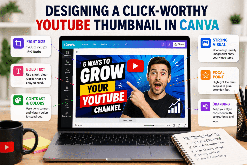
A professional thumbnail usually has a clear visual hierarchy.
One Main Focal Point
Choose one element that receives the most attention.
This could be:
- A person’s face
- A product
- A finished design
- A dramatic object
- A before-and-after comparison
Too many competing focal points make the design harder to understand.
Strong Typography
Typography should be functional first and decorative second.
Choose fonts that remain readable on mobile screens. Avoid using several decorative typefaces in one thumbnail.
A simple combination of a bold headline and a smaller supporting element can often work better than a complicated typographic layout.
Intentional Color
Color can communicate mood and create visual separation.
For example, a business tutorial may benefit from a clean professional palette, while a gaming video might use more energetic colors.
Do not choose colors randomly. Think about your audience and the personality of your channel.
Facial Expressions
For personality-driven channels, expressive faces can create an immediate emotional cue.
YouTube recommends considering the target audience when choosing thumbnail imagery and suggests that universally recognizable actions or emotions can be useful for casual viewers.
YouTube Thumbnail Best Practices
A successful Canva YouTube Thumbnail Guide should focus on more than just Canva’s editing features. The real goal is effective communication.
Keep these principles in mind:
Keep Your YouTube Thumbnail Design Simple
A viewer should understand the visual idea quickly.
Instead of adding six different graphics, start with one strong image, a short phrase, and supporting design elements.
Match the Thumbnail With Your Video
Your thumbnail should accurately represent the content.
This builds trust and gives viewers a reason to stay after clicking.
Design YouTube Thumbnails for Mobile Viewers
Many viewers discover content on smaller screens. Therefore, tiny text and subtle details can disappear.
Test your design at a reduced size before publishing.
Create Curiosity Without Clickbait
A good thumbnail can make viewers curious without misleading them.
For example:
Weak:
“Watch This!”
Stronger:
“3 DESIGN MISTAKES”
The second option gives viewers a specific reason to learn more.
Use YouTube Analytics to Improve Thumbnails
Do not rely only on your personal opinion.
YouTube Studio provides impression and click-through-rate data that can help you understand how your thumbnail and title perform together.
Remember that CTR can vary according to audience, traffic source, and where the thumbnail appears. YouTube advises creators to interpret the metric in context.
Common Canva YouTube Thumbnail Mistakes to Avoid
Even attractive designs can perform poorly if they have usability problems.
Using Too Much Text on a Thumbnail
A paragraph does not belong on a thumbnail.
Use a few powerful words instead.
Choosing Weak Color Contrast
If your text blends into the background, viewers may ignore it.
Add contrast or simplify the background.
Using Generic Images
A generic image may make your video look similar to hundreds of others.
Whenever possible, use original photos, screenshots, products, faces, or visuals connected to your content.
Creating Inconsistent Thumbnail Branding
If every thumbnail looks completely different, viewers may struggle to recognize your channel.
Create a flexible visual system and reuse it strategically.
Using Misleading Thumbnail Designs
Avoid exaggerated claims or images that have little connection to the video.
YouTube’s thumbnail policies apply to custom thumbnails, so creators should ensure their designs comply with the platform’s guidelines.
Ignoring YouTube Thumbnail Performance
A thumbnail that looks good to you is not automatically a successful thumbnail.
Use analytics to learn what your audience responds to over time.
Canva YouTube Thumbnail Checklist
Before uploading your design, run through this quick checklist:
- Is the thumbnail 1280 × 720 pixels?
- Does the design use a 16:9 layout?
- Is there one obvious focal point?
- Can the text be read on a small screen?
- Does the thumbnail match the video?
- Is there enough contrast?
- Does the design fit your channel branding?
- Have unnecessary elements been removed?
- Does the image create curiosity without misleading viewers?
- Have you checked the final image at a smaller size?
- Will you review impressions and CTR after publishing?
This checklist can become part of your regular YouTube publishing workflow.
Create Better YouTube Thumbnails With Canva
You do not need expensive software to create an effective YouTube thumbnail.
With Canva, you can start with the correct dimensions, select a strong visual, create readable typography, apply contrast, and develop a consistent brand style.
The biggest improvement often comes from simplifying your design.
Instead of asking, “What else can I add?” ask, “What can I remove while keeping the message clear?”
That mindset can make your thumbnails cleaner, faster to understand, and more professional.
If you are building a YouTube channel for a business, personal brand, educational project, or creative portfolio, consider creating a reusable Canva thumbnail system. A consistent template can save time while still allowing every video to have a unique visual identity.
Ready to improve your channel visuals? Explore more design resources on Design Made Simple, or contact your design team for help creating professional, consistent YouTube graphics that match your brand.
Frequently Asked Questions About Canva YouTube Thumbnails
What Is the Best Canva YouTube Thumbnail Size?
The standard recommended YouTube thumbnail size is 1280 × 720 pixels with a 16:9 aspect ratio. Canva provides YouTube thumbnail templates that use the appropriate dimensions.
How Do I Make a YouTube Thumbnail in Canva?
Open Canva, search for YouTube Thumbnail, choose a template or blank design, add your main image, create short readable text, apply contrast, add branding, and export the finished image.
What Makes a YouTube Thumbnail Clickable?
A strong thumbnail usually has a clear focal point, readable text, strong contrast, relevant imagery, and a compelling visual idea. It should create interest while accurately representing the video.
Should I Add Text to a Canva YouTube Thumbnail?
Yes, text can be useful when it adds context or communicates the video’s main benefit. However, keep it short and readable. YouTube recommends avoiding overly complex designs and using fonts that are easy to read.
How Can I Improve My YouTube Thumbnail Performance?
Use YouTube Studio to review impressions and impressions click-through rate. Compare performance over time and consider traffic source, audience, and the video topic before making design decisions.
Conclusion: Canva YouTube Thumbnail Guide
Creating a professional YouTube thumbnail does not have to be complicated. With Canva, creators can build attractive visuals using templates, images, typography, color, and simple layouts.
The key is to design for the viewer first. Use a strong focal point, keep text readable, maintain visual consistency, and make sure the thumbnail accurately represents the video.
Most importantly, continue learning from your analytics. A successful Canva YouTube Thumbnail Guide is not just about creating a beautiful image; it is about developing a repeatable design process that helps your audience recognize, understand, and explore your content.
Start with one clear idea, simplify the design, publish it, and use real performance data to make your next thumbnail even better.