
Introduction
Learning how to create professional designs in Canva can help you produce attractive graphics for your business, blog, social media accounts, presentations, and marketing campaigns without years of design experience. Canva offers accessible design tools, ready-made templates, customizable layouts, and a large collection of visual elements.
However, professional design involves more than choosing an attractive template. The best results come from combining clear communication, consistent branding, readable typography, balanced colors, and thoughtful spacing.
Whether you are a beginner, small business owner, marketer, or content creator, this guide will help you turn simple Canva projects into polished designs that look intentional and communicate your message effectively.
Table of Contents
- Why Professional Canva Designs Matter
- Understand the Basics of Good Design
- How to Create Professional Designs in Canva Step by Step
- Essential Canva Design Tips
- Benefits of Professional Canva Designs
- Common Canva Design Mistakes to Avoid
- Professional Design Checklist
- Frequently Asked Questions
- Conclusion
Why Learn How to Create Professional Designs in Canva?
Visual content often creates the first impression of a brand. A well-designed social media post, presentation, advertisement, or website graphic can make information easier to understand and help a business appear trustworthy.
For example, imagine two businesses advertising the same service. One uses a crowded graphic with several fonts and unrelated colors. The other uses a clear headline, a relevant image, consistent brand colors, and a simple call to action. The second design is more likely to communicate its message quickly.
Professional designs are particularly useful for:
- Small businesses: Create promotional graphics, menus, flyers, and product advertisements.
- Bloggers: Design featured images, Pinterest graphics, and visual guides.
- Marketers: Produce campaign graphics, lead magnets, and social media content.
- Students and professionals: Build presentations, reports, and portfolios.
- Content creators: Maintain a recognizable visual style across platforms.
Canva makes these tasks accessible, but design decisions still matter. A template is a starting point, not a substitute for a clear visual strategy.
Basic Design Principles for Professional Canva Designs
Before opening the Canva editor, understand the principles that make a design look professional.
Visual Hierarchy in Professional Canva Designs
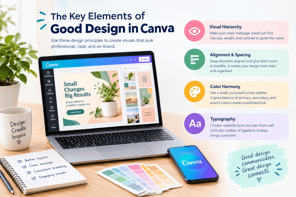
Visual hierarchy determines what viewers notice first, second, and third. Your main headline should usually receive the most attention, followed by supporting information and the next action.
Use font size, weight, position, and contrast to establish this order.
For example, a promotional post might feature a large headline, a smaller description, and a clearly visible button-style call to action.
Canva Layout and Alignment Best Practices
Consistent alignment makes a design look organized. Use Canva’s alignment guides and positioning tools to line up text, images, and shapes.
Leave enough empty space around important elements. This negative space reduces clutter and helps viewers focus on the message.
Choosing Professional Canva Color Palettes
Choose a small, purposeful color palette rather than using every color you like. A practical starting point is one primary color, one secondary color, and one accent color, supported by neutral shades.
For a wellness brand, for example, muted green, warm cream, and charcoal may create a calm and consistent appearance.
Typography Tips for Professional Canva Designs
Typography affects both readability and personality. Pair a distinctive heading font with a simple body font, and avoid using too many typefaces in one design.
Make sure the text remains readable at its intended viewing size, especially on mobile devices.
How to Create Professional Designs in Canva Step by Step
Follow this process whenever you create a new design.
Step 1: Define Your Goal for a Professional Canva Design
Start by deciding what the design needs to accomplish. Are you promoting a product, explaining an idea, announcing an event, or encouraging people to visit a website?
Identify your audience and the single most important message.
For example, a local bakery promoting a weekend offer needs a clear product image, the offer details, and a simple way to order. Decorative elements should support those details rather than compete with them.
Step 2: Choose the Right Canva Design Format
Open Canva and select a suitable design type or enter custom dimensions. Choose a format that matches the destination.
Examples include:
- Instagram posts for social media updates.
- Pinterest pins for visual discovery and blog promotion.
- Presentation layouts for meetings and educational content.
- Flyers for events and local promotions.
- YouTube thumbnails for video content.
- Blog graphics for featured images and article illustrations.
Always check the latest platform specifications before publishing. The correct dimensions help prevent important text or images from being cropped.
Step 3: Choose Canva Templates for Professional Designs
Search Canva’s template library using descriptive terms related to your project, audience, and design style.
Choose a template with a useful layout and clear visual hierarchy. Avoid selecting one simply because it looks attractive.
Next, customize the template by replacing placeholder text, updating colors, inserting relevant images, and removing unnecessary decorations.
A useful rule is to preserve the template’s strong structure while making the finished design distinctly yours.
Step 4: Build a Consistent Brand with Canva
If you are designing for a business, establish a consistent visual identity before creating multiple graphics.
Prepare the following assets:
- An approved logo.
- Primary and secondary brand colors.
- Heading and body fonts.
- A consistent photography or illustration style.
- Reusable layouts for recurring content.
Canva’s Brand Kit features can help eligible users organize brand assets and apply them across designs. Available features depend on the plan and account setup.
For example, a marketing agency can use the same logo placement, color palette, and heading style across its presentations, social posts, and downloadable guides.
Step 5: Choose High-Quality Images for Canva Designs
Visual assets should reinforce the message. Choose clear photographs, relevant illustrations, or simple icons that suit your audience and brand.
When selecting images, consider:
- Image quality and resolution.
- Lighting and color consistency.
- Subject placement and available text space.
- Relevance to the message.
- Licensing and permitted commercial use.
Avoid stretching low-resolution images or mixing unrelated illustration styles. Also, review the usage terms for Canva assets and any externally sourced images before using them commercially.
Step 6: Improve Typography in Professional Canva Designs
Create a clear difference between headings, supporting text, and small details.
Use a strong heading to attract attention, readable body text to explain the offer, and a contrasting style for the call to action.
Keep sentences concise. If the design contains too much text, edit the copy instead of continually shrinking the font.
For example, replace a long promotional paragraph with a benefit-focused headline and two short supporting points.
Step 7: Improve Layout and Visual Balance in Canva
Arrange elements so the viewer’s eyes move naturally through the design.
Use Canva’s positioning and alignment tools to correct uneven spacing. Make related items visually close to one another, and separate unrelated sections.
Zoom out to inspect the overall composition. A design that looks attractive when enlarged may feel crowded when viewed as a small social media thumbnail.
Step 8: Export Professional Canva Designs Correctly
Before exporting, check the spelling, dates, prices, links, logo placement, and visual consistency.
Choose a suitable file format for the intended use:
- PNG: Useful for many digital graphics and designs requiring crisp edges.
- JPG: Suitable for many photographs and web graphics where smaller file sizes matter.
- PDF: Useful for many documents, flyers, and print-ready layouts, depending on the printer’s specifications.
- MP4: Suitable for supported video designs and animated content.
For print projects, confirm the required dimensions, resolution, color settings, and bleed requirements with your printer.
Professional Canva Design Tips for Better Results
Keep the design simple
Every element should have a purpose. Remove decorative shapes, extra icons, or background effects that do not improve understanding.
Simple designs are not necessarily plain. They use a few carefully selected elements to create a stronger result.
Use contrast to improve readability
Make sure text stands out against its background. Avoid placing pale text over a light photograph or dark text over a dark image.
The W3C recommends a contrast ratio of at least 4.5:1 for normal text and 3:1 for large text under WCAG’s Level AA contrast criterion. These are useful benchmarks when creating accessible digital content.
Design for mobile screens
Many people view social graphics on phones. Preview your design at a smaller size and check whether the headline, main image, and important details remain easy to understand.
Keep essential information away from edges where it could be cropped.
Create reusable templates
If you publish content regularly, create a repeatable design system. Save layouts for weekly posts, blog images, promotional announcements, or presentation slides.
Reusable templates save time and help maintain brand consistency without making every design identical.
Use AI tools thoughtfully
Canva’s available AI-powered features may help with drafting content, generating or editing visuals, and speeding up selected tasks. Feature availability can change, and some tools may require a paid plan.
Treat AI output as a first draft. Check factual accuracy, image quality, brand suitability, and whether the final result communicates the intended message.
For additional learning, explore Canva Design School.
Benefits of Creating Professional Designs in Canva
Creating polished designs in Canva offers several practical advantages.
Faster content production: Templates and reusable brand assets can reduce repetitive work.
Consistent branding: Shared colors, fonts, and layouts help customers recognize your business across channels.
Lower barriers to design: Beginners can create useful visual content without mastering complex professional software first.
Flexible collaboration: Depending on the features available to your account, Canva can support sharing, feedback, and collaborative workflows.
More effective communication: Good hierarchy and readable layouts help audiences understand information quickly.
However, Canva is not a complete replacement for every professional design tool. Complex illustrations, specialized print production, advanced photo manipulation, and detailed vector workflows may require other software or an experienced designer.
Common Canva Design Mistakes to Avoid
Avoid these mistakes when creating your next project:
- Using too many fonts: Limit typefaces and establish clear heading and body styles.
- Overloading the layout: Remove elements that distract from the main message.
- Ignoring alignment: Use guides and consistent spacing to create order.
- Choosing colors without considering contrast: Test text against its actual background.
- Using irrelevant stock images: Select visuals that genuinely relate to the subject.
- Copying templates without customization: Adapt layouts to your brand and communication goals.
- Ignoring file requirements: Check platform dimensions or printer specifications before exporting.
- Forgetting accessibility: Do not rely on color alone to communicate meaning, and keep essential text readable.
A final review can catch many of these problems before your design reaches customers.
Professional Design Checklist
Use this checklist before publishing or sharing a Canva project.
- The design has one clear purpose.
- The headline communicates the main message.
- Colors and fonts match the intended visual identity.
- Text is readable on mobile and desktop screens.
- Images are relevant and sufficiently clear.
- Elements are aligned and evenly spaced.
- Important information is not too close to the edges.
- Spelling, dates, prices, and contact details are correct.
- Assets are used according to their licensing terms.
- The exported file matches the intended platform or print requirements.
Frequently Asked Questions About Professional Canva Designs
1. How to create professional designs in Canva as a beginner?
Start with a suitable template, define your main message, use a consistent color palette, limit your fonts, and maintain clear spacing. Review the design at its intended viewing size before exporting.
2. Can Canva designs look professional?
Yes. Canva can produce polished social media graphics, presentations, flyers, marketing materials, and other visual content when you apply strong design principles and use appropriate assets.
3. Is Canva free for professional design?
Canva offers a free plan with useful design tools and assets. Some premium templates, content, and advanced features require a paid plan. Check the current plan details before choosing a subscription.
4. Which Canva file format should I use?
PNG and JPG are common choices for digital graphics, PDF is useful for many documents and print projects, and MP4 works for supported video designs. Always follow the requirements of your destination platform or printer.
5. How can I make Canva designs consistent with my brand?
Use the same approved logo, colors, fonts, image style, and layout rules across your content. Where available, use Canva’s Brand Kit and reusable templates to simplify the process.
Conclusion : How to Create Professional Designs in Canva
Learning how to create professional designs in Canva is about making purposeful design choices, not adding more effects or decorations. Start with a clear message, build a strong layout, choose readable fonts, use harmonious colors, and maintain consistency across your visual content.
Before publishing, check alignment, contrast, image quality, spelling, and export settings. These small improvements can make a meaningful difference to how your work looks and communicates.
Whether you are creating social media graphics, business promotions, blog images, or presentations, practice these techniques and refine your approach with every project.
Ready to improve your brand’s visual content? Explore more tutorials on Design Made Simple and start creating designs that communicate clearly and look professional. If your business needs a more consistent visual identity or tailored marketing graphics, consider requesting a design consultation or quote from a qualified design professional.